What makes a city great? A new way to look at urban data will give us clues.

In 1748, the Italian surveyor Giambattista Nolli published a map of Rome that has become one of the most influential works in the history of urban planning. Nolli’s map was a meticulously detailed ground plan of the city. It set out the layout of buildings and streets as well as enclosed civic spaces, such as the colonnades in St Peter’s Square.
Nolli’s approach, known as ichnography, has been copied by urban planners ever since. Indeed, his maps of Rome were so good that the government continued to use them for city planning until the 1970s.
At about that time, urban planners became interested in comparing the built and unbuilt space in cities using maps that are similar to Nolli’s. These diagrams, called figure grounds, show built space in black and unbuilt in white.
In 1990s, the urban planner Allan Jacobs used them to compare the central square miles of cities all over the world. The maps clearly revealed and compared the grid structures of cities like New York, the more complex meshes of older cities like Rome, and the open, functional approach in modernist cities like Brasilia.
Surveyors like Jacobs and Nolli always drew their plans by hand. That’s a time-consuming business, so urban planners would love the tools to create and compare diagrams more easily.
Enter Geoff Boeing at the University of Southern California in Los Angeles, who has developed a range of computational tools that have the potential to transform the way urban planners think about cities. Boeing’s tools can quickly create Nolli maps, figure grounds, and various other urban diagrams in ways that set the stage for a revolution in urban planning.
Boeing’s method is the result of two separate developments. The first is the creation of high-quality maps of the planet that are freely available via a project called Open Street Maps. The second is Boeing’s development of a software package called OSMnx for analyzing and visualizing this open-source mapping data.
This software has allowed Boeing to create Nolli maps and figure grounds in unprecedented number. These show just how different cities can be.
But he’s also gone further by experimenting with other ways to visualize city landscapes. For example, the software allows him to study the network properties of cities and their level of disorder—their entropy.
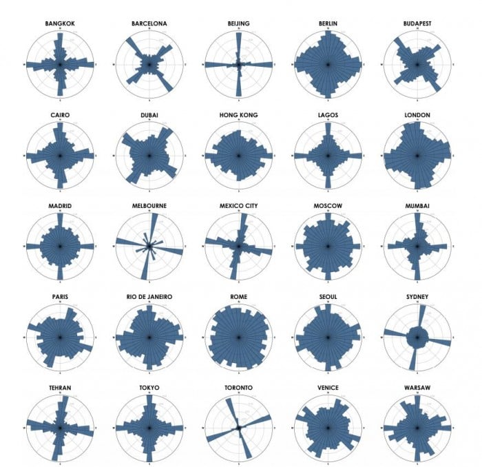
He’s also used polar histograms, otherwise known as rose diagrams, to plot the number of city streets running in a particular direction. This immediately reveals how closely the city follows a grid structure or a more random set of orientations.
According to the statistician Edward Tufte, one of the goals of data visualization is to allow viewers to think about data on a different level. Good diagrams, he says, should be instruments of reason.
Boeing certainly achieves this with his visualizations (although not with his writing in this paper). And there is plenty more work to be done.
One of the key properties of cities is how successful they are in creating vibrant communities. This vibrancy is an elusive property—many urban planners have failed in their attempts to create it, mainly because they don't accurately understand the factors that make cities successful.
There are various theories about urban vibrancy. Perhaps the most convincing is from the late social activist Jane Jacobs, who set out the magic ingredients in her book The Death and Life of Great American Cities.
Jacobs argued that vibrant city life can flourish only in neighborhoods that meet several conditions. For example, they must serve two or more functions, to attract people with different purposes throughout the day and night. City blocks must be small, with numerous intersections that force pedestrians to interact. And the buildings must be diverse and dense to support a mix of tenants.
The main criticism of Jacobs’s work is that it lacks evidence to back it up. However, recent work on urban data sets has begun to find Jacobs’s signatures of vibrancy in real cities. Visualizing this clearly for a wide range of cities is still a challenge. But Boeing’s software tools could change that, particularly if they can be let loose on other data sets.
That should be an urgent goal for urban planners. There are plenty of examples of egregious mistakes in the way cities are developed, often for want of a clear idea of what makes a city vibrant.
The new data-driven approach from Boeing and others has the potential to finally turn urban planning into an evidence-based science. Giambattista Nolli would surely approve.
Ref: arxiv.org/abs/1910.00118 : Spatial Information and the Legibility of Urban Form: Big Data in Urban Morphology
Keep Reading
Most Popular
Large language models can do jaw-dropping things. But nobody knows exactly why.
And that's a problem. Figuring it out is one of the biggest scientific puzzles of our time and a crucial step towards controlling more powerful future models.
How scientists traced a mysterious covid case back to six toilets
When wastewater surveillance turns into a hunt for a single infected individual, the ethics get tricky.
The problem with plug-in hybrids? Their drivers.
Plug-in hybrids are often sold as a transition to EVs, but new data from Europe shows we’re still underestimating the emissions they produce.
Google DeepMind’s new generative model makes Super Mario–like games from scratch
Genie learns how to control games by watching hours and hours of video. It could help train next-gen robots too.
Stay connected
Get the latest updates from
MIT Technology Review
Discover special offers, top stories, upcoming events, and more.